Graph system from Salespanel Reports is a great way to look at the trend from visitors and your qualified leads. We generate the trend graph for global reports as well as reports for each Segment and they are updated with your latest traffic data in real-time.
Before we get into trends, let us quickly revise the structure of the reporting system. There are three important dimensions to look at:
- All visitors
- Visiting companies
- Identified leads
We provide numbers for two default segments out of the box. These numbers are available on every report screen to help you with calculating conversion numbers.
- Default segment for active visitors
- Default segment for new visitors
Active visitors were last seen during the selected date range. New visitors are first seen during the selected date range. There are different use cases and scenarios why one would like to focus on active or new visitors. For example: if you are interested only in new leads for a particular time period and you want clean data, focus on new visitors.
Apart from these two default segments, whenever you apply a filter or when you are looking at a report in a Segment ( Your saved filters ), the third row in the report will be for this filtered segment. Since every row in the report is a Segment with a number of identified leads, you can quickly look at the average conversion for your traffic and compare it with the conversion for your selected filters.
You can use filters with visitor attributes and behavioral data in creating your own definition of qualified visitors and reports would reflect that. That means you can quickly find out how your visitors convert into qualified leads and connect with the revenue.
Another thing we would like to point out is that unlike classical statistics-based analytics, our approach is on helping you focus on metrics related to qualified leads. This comes obviously to the product as before you come to the reports, the product starts with helping you think about what's your tracking and qualification strategy. This reporting system will help you to actually connect your sales metrics with marketing observations. Since you are able to connect your CRM data such as deals exist or not, or only look at visitors for whom we have won deals. Graph-based reports will help you to crack patterns: when did something increase or decrease? Simple yet powerful.
Here are some examples:
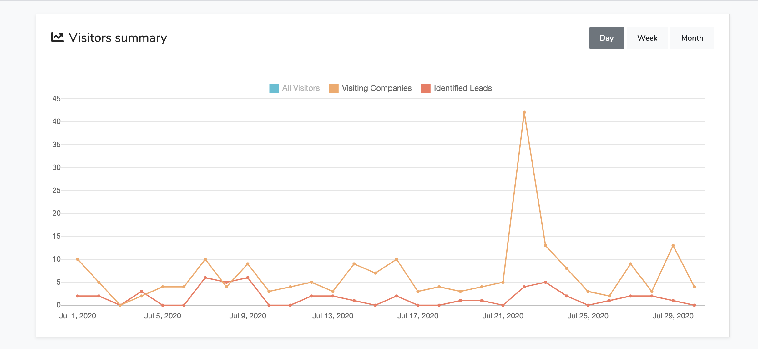
In this example, you can see that the number of identified leads for this data is not correlated with an increase of visiting companies in the month of July.
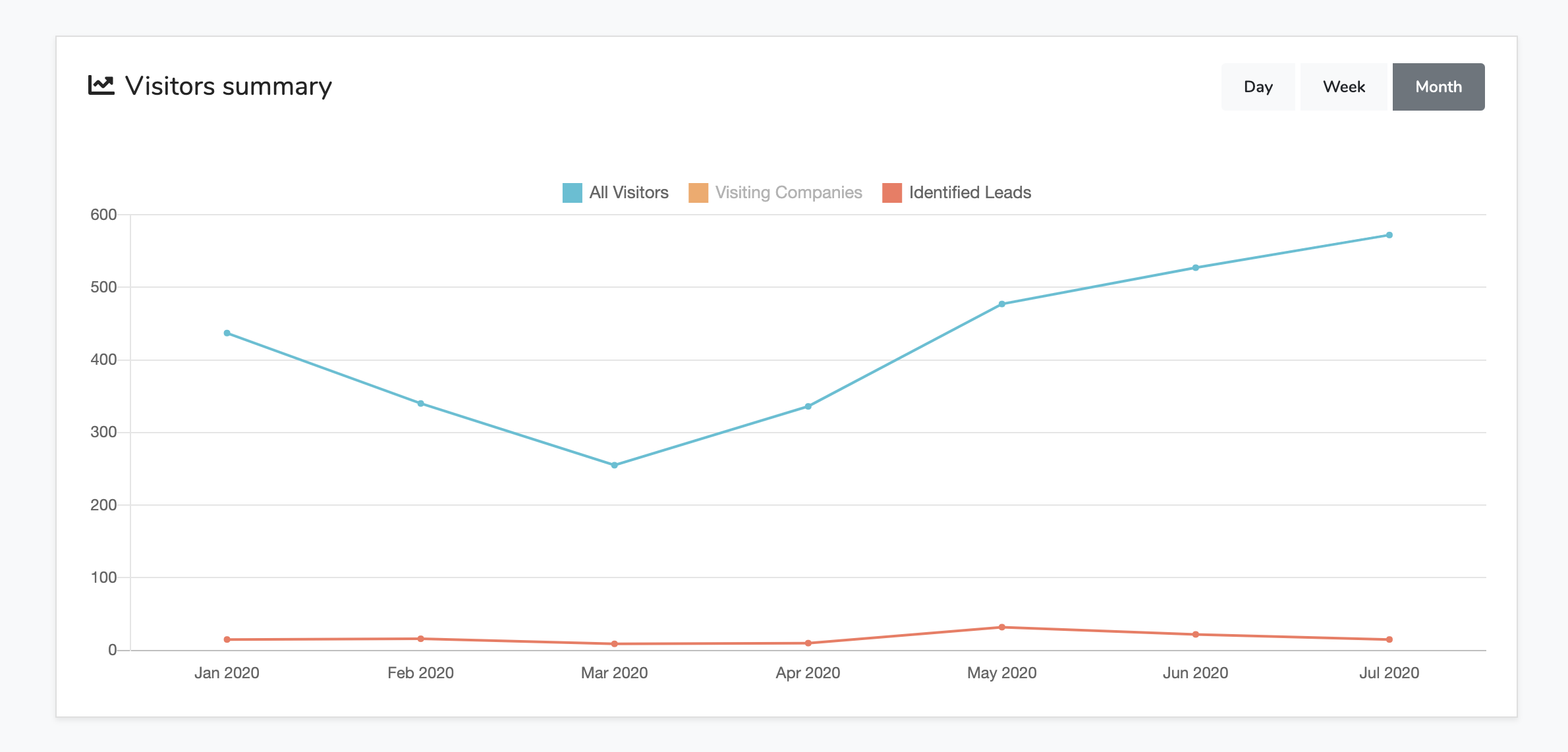
This example is from a Segment tracking organic visitors. As you can see the number of organic visitors is increasing but for this data, it's not helping to increase identified leads. That means this data has improved on top-of-the-funnel awareness but the number of leads generated is roughly the same.
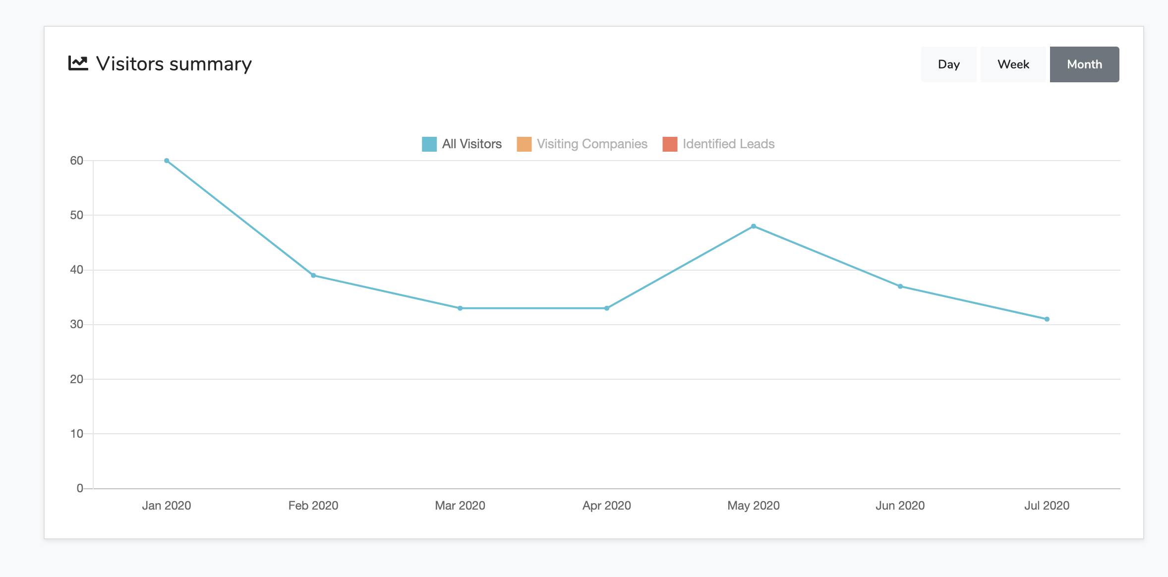
And this one is probably our favorite. So for this report, we have a filter applied that the lead score must be greater than 40. That's a tough benchmark of how qualified leads were generated during this time period. Although the actual number of monthly leads is way higher for this data set. You can actually look at the trend for real qualified leads who have a lead score of 40 or more. The actual number of good leads were less than 100 for every month.
These were a few random examples in order to show you how powerful these trends can be for you. Instead of just looking at passive statistics which reports you about what happened on a random crowd Salespanel will help you to focus on tracking qualified visitors and then looking at their trends. Please let us know if you need more help with this.